
 English
 Español

Industry News

Industry News
How Do You Mix Colors and Textures in Decorator Christmas Ornaments
Christmas decorating isn't just red ornaments on green branches anymore. Many households now try different color combinations, surface finishes and decorative materials to build a holiday mood that reflects their own taste. Decorator Christmas ornaments sit at the center of this shift. They bring together traditional colors, modern finishes, natural materials and small personal details, and the room still doesn't feel crowded.
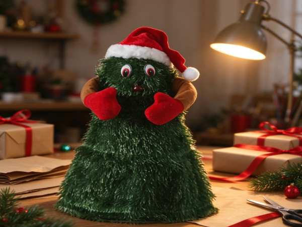
For retailers, decorators and buyers, this growing interest opens the door to ornament collections with varied visual styles. Color and texture shape how an ornament looks alone and how it plays with the decorations around it. A glossy red bauble makes a different impression from a matte ceramic star, even in the same color. Seeing these differences helps people choose well for Christmas trees, mantelpieces, windows and other festive displays.
Why Do Color and Texture Matter in Christmas Ornament Design?
Color grabs attention. Texture gives the eye something more to explore. When the two work together, a collection of Christmas ornaments feels connected without feeling repetitive.
Color also sets the mood of a space. Red and green bring the familiar Christmas feeling. White, silver and pale blue create a cool winter atmosphere. Gold, brown and cream add warmth, while muted green and earthy shades suit interiors that favor natural materials.
Texture adds another layer to these choices. A smooth glass ornament reflects nearby lights and decorations. A velvet-covered ball soaks up more light and looks softer. Wooden figures show visible grain, and knitted or fabric ornaments add a relaxed, handmade feel.
The differences stand out when several ornaments sit together. A collection made only of shiny surfaces looks visually flat, even with varied colors. A display that mixes reflective, matte, rough and soft finishes gains depth.
The goal isn't to include every color or material on the shelf. It's to pick elements that support one decorative idea. A restrained palette handles several textures well. A colorful collection does better with simpler finishes, so the arrangement doesn't get busy.
Which Color Combinations Work Well with Decorator Christmas Ornaments?
A color palette is a good starting point. Don't pick each ornament one by one. Think about how the colors look together across the whole display.
Traditional red and green
Red and green remain the familiar Christmas choice. Their strong contrast is easy to recognize, but the balance between them changes the character of a display.
Deep green ornaments paired with warm red pieces give a classic look. Cream details or natural wooden decorations soften the contrast. Gold accents add warmth without needing another dominant color.
Different shades keep the arrangement from looking repetitive. Burgundy, forest green and muted gold offer more variety than a single shade of red and green across the tree.
Neutral colors with metallic accents
Cream, beige, white and soft gray work well in rooms with understated interiors. These shades let the shape and finish of each ornament stand out.
Metallic gold, silver or copper brings contrast. A brushed gold ornament looks quieter than a highly reflective one. Silver feels cooler, and copper complements warm wood and brown fabrics.
This approach suits decorators who want Christmas ornaments to blend with existing furniture, not dominate the room.
Nature-inspired colors
Earthy colors offer another route to a cohesive holiday display. Forest green, brown, moss, ivory and muted red sit well beside pine branches, woven baskets, wooden decorations and natural fabrics.
These combinations fit rustic, farmhouse and nature-inspired interiors. They also make decorative ornaments feel less seasonal, so some pieces stay in the home decor after the tree comes down.
Cool winter shades
White, pale blue, silver and soft gray build a winter-inspired palette. The effect depends on the finishes. Frosted surfaces and translucent ornaments suggest snow and ice. Polished silver brings sharper reflections.
A touch of warm cream or natural wood stops the display from feeling too cold. The contrast helps most when the room already holds many cool colors.
When choosing a palette, look at the room before the ornaments. Wall colors, curtains, upholstery, flooring and lighting all change how Christmas decorations appear. A shade that looks balanced in a store feels different beside dark furniture or warm-toned walls.
How Can Different Textures Be Combined Without Creating Clutter?
Texture mixing runs on contrast. The best arrangements give each surface a reason to be there. They don't treat every ornament as its own statement.
Glass and acrylic ornaments tend to have smooth, reflective surfaces. Ceramic pieces look matte, glazed or slightly irregular. Wooden ornaments bring natural grain, and fabric decorations add softness. Metal details add a firmer visual character. Paper ornaments contribute delicate folds or layered shapes.
Combining these materials makes an engaging display, but the arrangement needs some visual consistency.
Try choosing one texture that runs through the whole collection and using other finishes for variation. A tree might carry mostly matte ornaments, with a smaller number of glossy baubles and metallic stars. The repeated matte finish ties the pieces together, and the reflective ones catch the light.
Shape affects how textures work together too. Round ornaments give continuity. Stars, bells, snowflakes and figurines add different outlines. A wooden star sits well beside a smooth glass ball because the two share a festive theme but differ in surface.
Scale counts as well. Large ornaments with pronounced textures draw the eye fast. Smaller decorations with subtle finishes fill gaps without competing. Spread these elements through the display to keep a natural visual rhythm.
Think about viewing distance, too. Texture differences that look obvious on a table vanish when ornaments hang across a large Christmas tree. At that scale, larger shapes and clear color contrasts keep the arrangement connected.
Should Glossy, Matte, and Metallic Finishes Be Mixed?
Yes. These finishes work together when each has a clear role. They respond to light differently, so a single color palette feels varied without piling on extra shades.
Glossy ornaments reflect nearby objects and light sources. They create small points of brightness across a tree or arrangement. Too many reflective pieces together produce distracting highlights, especially in rooms with strong lighting.
Matte finishes give a quieter contrast. They show the ornament's color without drawing attention to reflections. Matte balls, ceramic figures and painted wooden pieces give the eye a rest between shinier decorations.
Metallic finishes hold a different position. Gold, silver and copper act as accents and link several colors within one display. Brushed or antiqued metal looks softer than mirror-like surfaces, which suits collections that blend traditional and contemporary elements.
The mix gets interesting when the color stays constant. A collection of green ornaments might include glossy glass, matte ceramic and textured fabric. The color family stays connected, so the surfaces become the main source of variety.
Consider the lighting when you select. Warm indoor lights make gold and copper look richer, while cool lighting emphasizes silver and blue. Natural daylight reveals surface details that fade in the evening.
For product designers and retailers, these finish combinations shape how ornaments are grouped into collections. Pieces don't need identical surfaces to belong together. A shared color story, shape language or decorative theme provides the link.
How Do You Match Christmas Ornaments with Different Home Styles?
A successful ornament arrangement looks at the room as well as the tree. Christmas decorations share space with furniture, artwork, lighting and textiles. Their colors and textures either complement these elements or create a deliberate contrast.
Modern interiors
Modern spaces favor clean lines, simple shapes and restrained colors. Glass ornaments, geometric decorations, matte finishes and understated metallic details fit the setting.
A limited palette keeps things visually clear. Skip the many unrelated shapes and colors. Repeat a few forms and vary their surface finishes.
Rustic and farmhouse interiors
Wood, woven materials, linen and other tactile surfaces belong naturally in rustic settings. Wooden stars, fabric hearts, ceramic figures and ornaments with distressed finishes sit well beside greenery and natural branches.
Red and green still work, but earthy brown, cream and muted gold give a softer effect. The aim is decorations that feel tied to the materials already in the room.
Traditional interiors
Traditional rooms handle richer colors, decorative patterns and detailed accessories. Burgundy, deep green, gold and warm white support this style.
Ornaments with painted details, classic shapes and textured finishes add interest. Repeat selected motifs across the tree and nearby decorations to keep the display coordinated.
Minimalist interiors
Minimalist decorating relies on careful selection, not a large number of objects. A few ornaments with distinctive shapes or contrasting surfaces create interest without filling every space.
Matte white decorations, for example, pair with a handful of clear glass pieces and natural wooden accents. The differences stay visible because each ornament has room around it.
These approaches aren't strict rules. Mixing styles works too when the pieces clearly connect. A contemporary glass ornament sits comfortably beside a vintage figure if their colors, proportions or decorative details relate.
What Role Do Handmade and Personalized Ornaments Play in Color and Texture?
Handmade and personalized Christmas ornaments carry details that mass-produced decorations often lack. Small differences in shape, paint, fabric and surface finish give a collection a more individual character.
Hand-painted ceramic ornaments show visible brushwork. Felt decorations have stitched edges and embroidered patterns. Wooden pieces keep their natural grain, and glass ornaments carry layered colors or decorative patterns.
These details open up texture mixing. A smooth ornament contrasts nicely beside a stitched fabric figure. A painted wooden decoration connects with a natural color palette, and a personalized glass ornament adds a reflective accent.
Personalization adds meaning to a display. Names, family messages, initials and decorative motifs turn an ordinary arrangement into a collection of keepsakes. The ornaments differ from one another, yet a shared color scheme helps them fit the same display.
For retailers and buyers, personalized ornaments appeal beyond looks. Customers look for decorations tied to family traditions, gifts, hobbies or meaningful occasions. Offering different materials and finishes helps meet these preferences.
Personalized pieces don't always need to match every other decoration, though. Their distinctive details are often the reason they catch the eye. Place them where their shapes and inscriptions stay visible, and their individual character shines without disrupting the arrangement around them.
What Should Buyers and Decorators Consider When Selecting Ornament Collections?
Choosing Christmas ornaments means more than comparing colors. Material, finish, shape, intended use and storage needs all affect how a collection performs in everyday settings.
Check color consistency when ornaments are bought as a group. Different materials show the same nominal color in slightly different ways. A green fabric ornament looks softer than a green glass bauble, for example, because the surfaces reflect light differently.
Material suitability counts too. Glass ornaments give delicate reflections but need careful handling. Fabric and felt pieces offer a softer look, and wooden decorations suit homes that favor natural finishes. Families with young children or pets should think carefully about placement and material before decorating accessible areas.
Durability shapes purchasing decisions as well. Decorations meant for repeated seasonal use need to survive handling, packing and storage. Delicate surface details need extra protection, and fabric ornaments need different care from glazed ceramic pieces.
Buyers also need to plan how the collection will be displayed. Ornaments for a Christmas tree need different shapes and hanging arrangements from pieces for shelves, table settings, wreaths or window displays. A collection with varied forms offers flexibility, as long as the pieces still relate through color or design.
Packaging and presentation affect the shopping experience, particularly for gift-oriented products. Clear product descriptions and photographs from several angles help customers understand finishes, shapes and decorative details.
For decorators, retailers and product developers, the central design question is simple: what does each ornament add to the whole arrangement? Color builds the visual connection, texture brings contrast and shape sets the rhythm. Consider them together and Christmas ornaments form a cohesive display that keeps the small differences that make each piece distinctive.
NEXT:Minimalist‑vintage Santa Claus dolls reimagine modern festive soft furnishings
- Standing Santa Claus Figurine
- Rustic-Style Santa Claus Figurine
- Skiing Santa Claus Figurine
- Climbing And Hanging Santa Claus
- Electric Musical Santa Claus
- Santa Claus Figurine With A Creative Scene
- Christmas Figurines
- Santa Hat
- Tabletop Christmas Tree Ornament
- Christmas Snowman Decorative Figurine
- Rabbit Plush Toys
- Dog Plush Toys
- Cat Plush Toys
- Small Animal Plush Toys


- +86-13505800852
- ydxtoys1@163.com
- 2nd Floor, Building 1, No.8 Dongfa Road, Daidong Industrial Zone, Daishan, Zhoushan City, Zhejiang Province, China
